Giving clients full control of their content hierarchy — no help required

tl;dr

Problem

Zype customers had no way to build a content hierarchy — no nesting "Seasons" under "Genre," for example. That limitation hit TV and web apps hard, driving frequent support requests and confusion.

Results

Support calls and dev requests dropped from ~20/week to 0, with remaining inquiries shifting to feature requests. Client app releases sped up by ~25%.

Solution

A self-service video hierarchy tool customers could build and edit themselves, with zero handholding from support.

My behavior
  • Partnered with Customer Success to pinpoint the real pain point behind recurring support tickets
  • Led a trade-off session across dev, CX, and product to align on direction
  • Ran task-based prototype testing to separate must-haves from nice-to-haves
  • Tracked impact through support volume and app release velocity

Defining the problem

I started as Zype's sole designer, improving website conversion and product UX. Over time I expanded into leading design across marketing, new products, and subscriber apps — while also managing app developers, client app builds, and inbound customer service and sales requests.

Working closely with Customer Success, we found clients were increasingly frustrated by a structural limit: no way to nest content. A "Drama" playlist had no way to hold sub-playlists like "The Handmaid's Tale" or "Game of Thrones" beneath it — clients were stuck with flat, standalone folders.

I ran a scrappy comparative and competitive audit to see how similar platforms solved this, and pulled patterns that shaped early ideation.

“The platform hasn't caught up with the structure I need. Your team helping manually is nice, but it's unsustainable once we're adding and editing videos constantly.”

Digital Content Manager

Diverging and converging on designs

The bar was clear: clients needed to build and edit a real hierarchy — Genre > Series > Season > Episodes — consistently across TV, web, and mobile. I sketched quickly and worked with teammates, using visual exploration to pressure-test different directions fast.

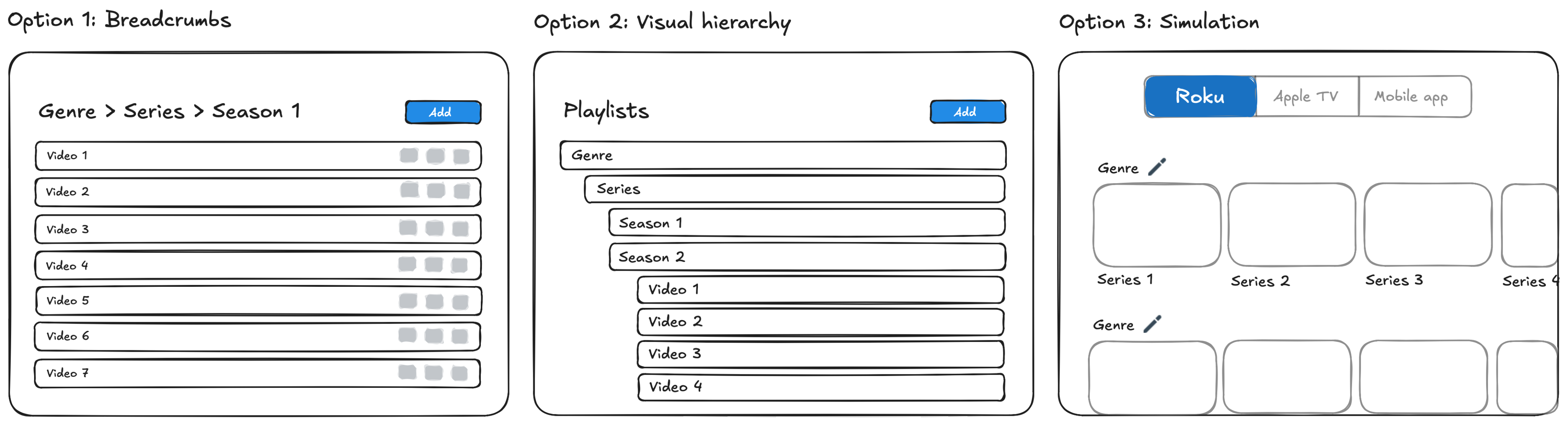
Wireframes showing 3 options for layout: Breadcrumbs, a bird's eye view visual hierarchy, or mimicing an actual app out in the wild

In a trade-off session with dev, CX, and product, we agreed "Simulating a client's app in the wild" was compelling, but better suited to a later review-before-publish moment — not this problem. The team unanimously chose "a bird's-eye view of the entire structure" for how quickly it let clients understand and edit their hierarchy at a glance.

With direction set, the real risk was scale: would this stay usable once a client had hundreds of playlists in one view? I ran task-based testing with 4 customers on a working prototype to find out, and to separate must-haves from later bets.

A few decisions came directly out of that testing:

  1. I split "add playlist" and "add video" into separate actions instead of one shared button. Customers frequently wanted to add several playlists at once — under a single Genre, for example — and the extra click was slowing them down.

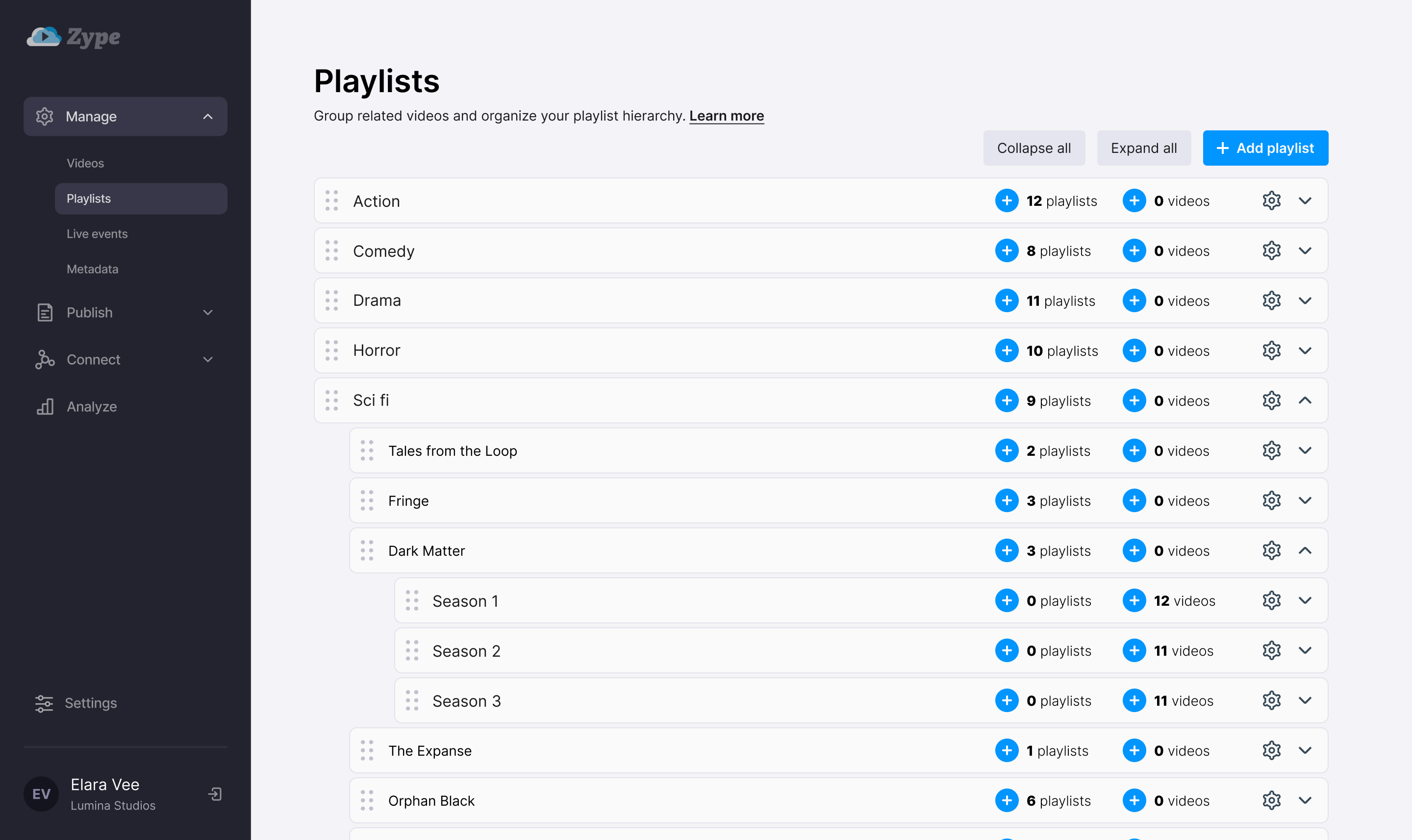
  1. I prioritized collapsing playlists over duplicating them, reversing an earlier leadership push. All 4 customers agreed the product would become unmanageable without collapsing; duplication was nice-to-have, not adoption-critical.
Detailed high fidelity mock showing playlists and videos nested within each other
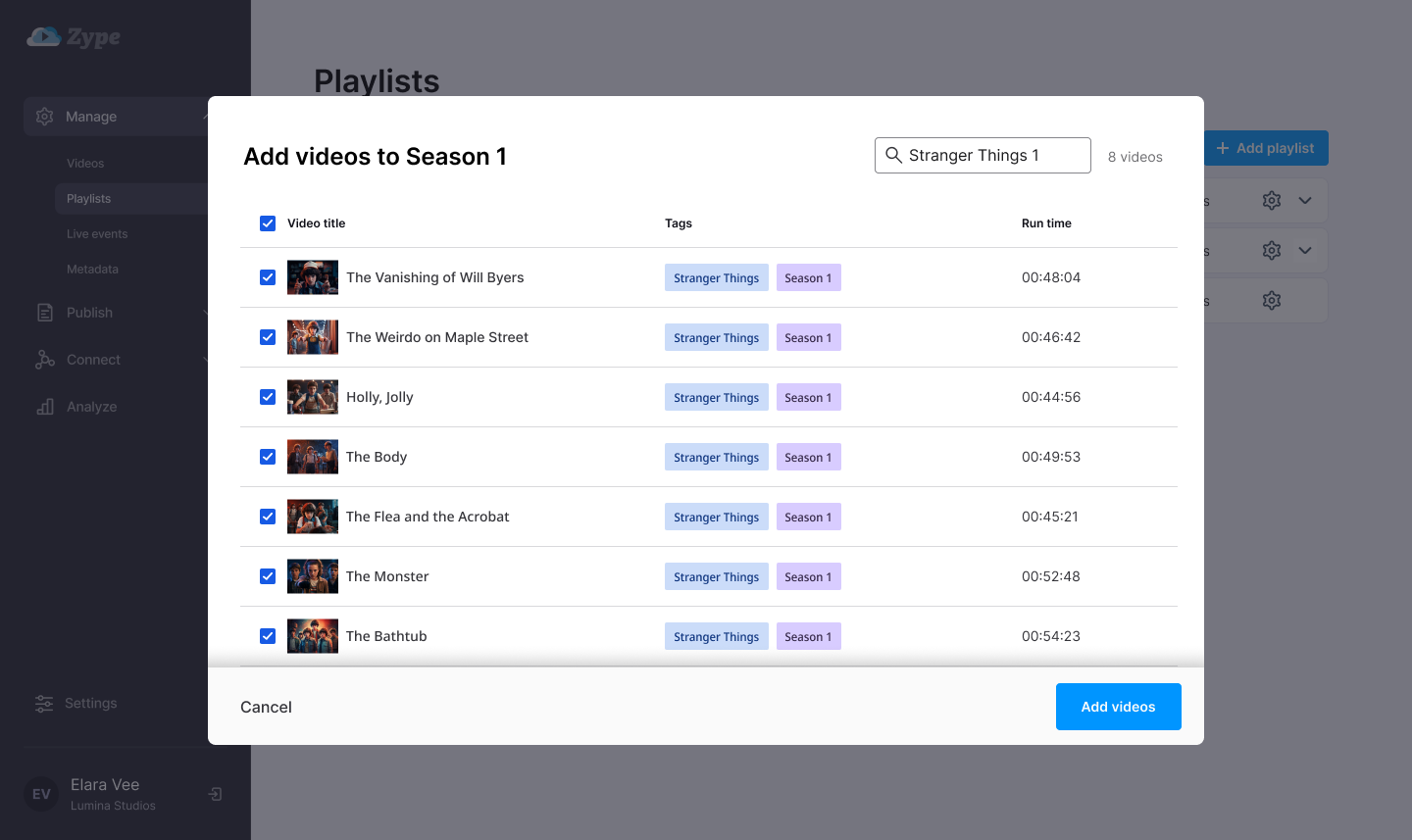
  1. I gave the video-selection step more space and attention, since it could get overwhelming fast depending on library size — bulk import by title or tag became a priority, not an afterthought.
High fidelity mock showing a modal popover for a user to bulk add videos to their playlist
  1. Drag-and-drop turned out to be load-bearing, not a nice-to-have — clients' entire workflow depended on reorganizing content fluidly. I tested it repeatedly with developers until it felt fast and reliable, not just functional.

Results and next steps

After launch, the shift was immediate. Customer Success reported support volume dropped from ~20 complaints a week to near zero — remaining feedback was entirely feature requests, driven by excitement over having real control.

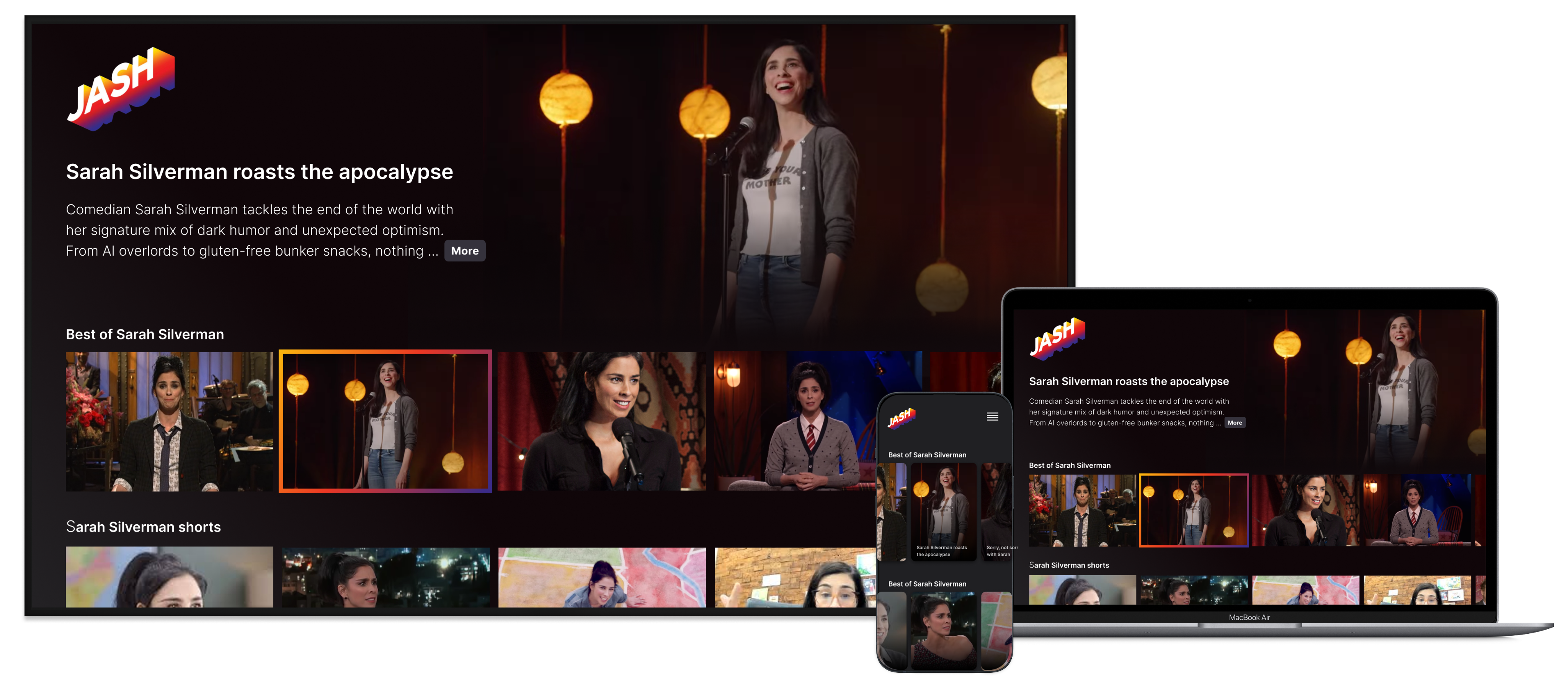
Client app launches sped up by ~25%, since clients were no longer blocked waiting on our internal team to hand-build custom hierarchies. That also freed up developer time to focus on new features instead of one-off workarounds.

Example of this hierarchy being displayed on a TV app, a laptop, and a mobile app.

Next steps:

  • Turn feature requests into a roadmap: Now that support tickets are feature requests instead of complaints, prioritize which ones unlock the most value across the client base
  • Stress-test at real scale: Validate the hierarchy view holds up cleanly for clients with libraries far larger than what testing covered
  • Extend self-service further: Look for the next manual workaround client teams still lean on us for, and make that self-service too

Say hello!

Giving clients full control of their content hierarchy — no help required

tl;dr

Problem

Zype customers had no way to build a content hierarchy — no nesting "Seasons" under "Genre," for example. That limitation hit TV and web apps hard, driving frequent support requests and confusion.

Results

Support calls and dev requests dropped from ~20/week to 0, with remaining inquiries shifting to feature requests. Client app releases sped up by ~25%.

Solution

A self-service video hierarchy tool customers could build and edit themselves, with zero handholding from support.

My behavior
  • Partnered with Customer Success to pinpoint the real pain point behind recurring support tickets
  • Led a trade-off session across dev, CX, and product to align on direction
  • Ran task-based prototype testing to separate must-haves from nice-to-haves
  • Tracked impact through support volume and app release velocity
Defining the problem

I started as Zype's sole designer, improving website conversion and product UX. Over time I expanded into leading design across marketing, new products, and subscriber apps — while also managing app developers, client app builds, and inbound customer service and sales requests.

Working closely with Customer Success, we found clients were increasingly frustrated by a structural limit: no way to nest content. A "Drama" playlist had no way to hold sub-playlists like "The Handmaid's Tale" or "Game of Thrones" beneath it — clients were stuck with flat, standalone folders.

I ran a scrappy comparative and competitive audit to see how similar platforms solved this, and pulled patterns that shaped early ideation.

“The platform hasn't caught up with the structure I need. Your team helping manually is nice, but it's unsustainable once we're adding and editing videos constantly.”

Digital Content Manager

Diverging and converging on designs

The bar was clear: clients needed to build and edit a real hierarchy — Genre > Series > Season > Episodes — consistently across TV, web, and mobile. I sketched quickly and worked with teammates, using visual exploration to pressure-test different directions fast.

Wireframes showing 3 options for layout: Breadcrumbs, a bird's eye view visual hierarchy, or mimicing an actual app out in the wild

In a trade-off session with dev, CX, and product, we agreed "Simulating a client's app in the wild" was compelling, but better suited to a later review-before-publish moment — not this problem. The team unanimously chose "a bird's-eye view of the entire structure" for how quickly it let clients understand and edit their hierarchy at a glance.

With direction set, the real risk was scale: would this stay usable once a client had hundreds of playlists in one view? I ran task-based testing with 4 customers on a working prototype to find out, and to separate must-haves from later bets.

A few decisions came directly out of that testing:

  1. I split "add playlist" and "add video" into separate actions instead of one shared button. Customers frequently wanted to add several playlists at once — under a single Genre, for example — and the extra click was slowing them down.

  1. I prioritized collapsing playlists over duplicating them, reversing an earlier leadership push. All 4 customers agreed the product would become unmanageable without collapsing; duplication was nice-to-have, not adoption-critical.
Detailed high fidelity mock showing playlists and videos nested within each other
  1. I gave the video-selection step more space and attention, since it could get overwhelming fast depending on library size — bulk import by title or tag became a priority, not an afterthought.
High fidelity mock showing a modal popover for a user to bulk add videos to their playlist
  1. Drag-and-drop turned out to be load-bearing, not a nice-to-have — clients' entire workflow depended on reorganizing content fluidly. I tested it repeatedly with developers until it felt fast and reliable, not just functional.

Results and next steps

After launch, the shift was immediate. Customer Success reported support volume dropped from ~20 complaints a week to near zero — remaining feedback was entirely feature requests, driven by excitement over having real control.

Client app launches sped up by ~25%, since clients were no longer blocked waiting on our internal team to hand-build custom hierarchies. That also freed up developer time to focus on new features instead of one-off workarounds.

Example of this hierarchy being displayed on a TV app, a laptop, and a mobile app.

Next steps:

  • Turn feature requests into a roadmap: Now that support tickets are feature requests instead of complaints, prioritize which ones unlock the most value across the client base
  • Stress-test at real scale: Validate the hierarchy view holds up cleanly for clients with libraries far larger than what testing covered
  • Extend self-service further: Look for the next manual workaround client teams still lean on us for, and make that self-service too

Say hello!

Giving clients full control of their content hierarchy — no help required

tl;dr

Problem

Zype customers had no way to build a content hierarchy — no nesting "Seasons" under "Genre," for example. That limitation hit TV and web apps hard, driving frequent support requests and confusion.

Results

Support calls and dev requests dropped from ~20/week to 0, with remaining inquiries shifting to feature requests. Client app releases sped up by ~25%.

Solution

A self-service video hierarchy tool customers could build and edit themselves, with zero handholding from support.

My behavior
  • Partnered with Customer Success to pinpoint the real pain point behind recurring support tickets
  • Led a trade-off session across dev, CX, and product to align on direction
  • Ran task-based prototype testing to separate must-haves from nice-to-haves
  • Tracked impact through support volume and app release velocity
Defining the problem

I started as Zype's sole designer, improving website conversion and product UX. Over time I expanded into leading design across marketing, new products, and subscriber apps — while also managing app developers, client app builds, and inbound customer service and sales requests.

Working closely with Customer Success, we found clients were increasingly frustrated by a structural limit: no way to nest content. A "Drama" playlist had no way to hold sub-playlists like "The Handmaid's Tale" or "Game of Thrones" beneath it — clients were stuck with flat, standalone folders.

I ran a scrappy comparative and competitive audit to see how similar platforms solved this, and pulled patterns that shaped early ideation.

“The platform hasn't caught up with the structure I need. Your team helping manually is nice, but it's unsustainable once we're adding and editing videos constantly.”

Digital Content Manager

Diverging and converging on designs

The bar was clear: clients needed to build and edit a real hierarchy — Genre > Series > Season > Episodes — consistently across TV, web, and mobile. I sketched quickly and worked with teammates, using visual exploration to pressure-test different directions fast.

Wireframes showing 3 options for layout: Breadcrumbs, a bird's eye view visual hierarchy, or mimicing an actual app out in the wild

In a trade-off session with dev, CX, and product, we agreed "Simulating a client's app in the wild" was compelling, but better suited to a later review-before-publish moment — not this problem. The team unanimously chose "a bird's-eye view of the entire structure" for how quickly it let clients understand and edit their hierarchy at a glance.

With direction set, the real risk was scale: would this stay usable once a client had hundreds of playlists in one view? I ran task-based testing with 4 customers on a working prototype to find out, and to separate must-haves from later bets.

A few decisions came directly out of that testing:

  1. I split "add playlist" and "add video" into separate actions instead of one shared button. Customers frequently wanted to add several playlists at once — under a single Genre, for example — and the extra click was slowing them down.

  1. I prioritized collapsing playlists over duplicating them, reversing an earlier leadership push. All 4 customers agreed the product would become unmanageable without collapsing; duplication was nice-to-have, not adoption-critical.
Detailed high fidelity mock showing playlists and videos nested within each other
  1. I gave the video-selection step more space and attention, since it could get overwhelming fast depending on library size — bulk import by title or tag became a priority, not an afterthought.
High fidelity mock showing a modal popover for a user to bulk add videos to their playlist
  1. Drag-and-drop turned out to be load-bearing, not a nice-to-have — clients' entire workflow depended on reorganizing content fluidly. I tested it repeatedly with developers until it felt fast and reliable, not just functional.

Results and next steps

After launch, the shift was immediate. Customer Success reported support volume dropped from ~20 complaints a week to near zero — remaining feedback was entirely feature requests, driven by excitement over having real control.

Client app launches sped up by ~25%, since clients were no longer blocked waiting on our internal team to hand-build custom hierarchies. That also freed up developer time to focus on new features instead of one-off workarounds.

Example of this hierarchy being displayed on a TV app, a laptop, and a mobile app.

Next steps:

  • Turn feature requests into a roadmap: Now that support tickets are feature requests instead of complaints, prioritize which ones unlock the most value across the client base
  • Stress-test at real scale: Validate the hierarchy view holds up cleanly for clients with libraries far larger than what testing covered
  • Extend self-service further: Look for the next manual workaround client teams still lean on us for, and make that self-service too

Say hello!