Enhanced playlists
A self-service product to enable clients to understand and flexibly manage their video content structure

-
Context
Zype is a software platform that allows video content owners to organize and manage their video collection and sell video directly to their fans.
-
Problem
Customers were frustrated at the lack of flexibility of their video management (“I want to group videos into a folder called ‘Seasons’ and house this within another folder ‘Genre’ “). The lack of this hierarchy was also mirrored within their video apps like Roku or Apple TV. Not surprisingly, a good chunk of our Customer Success team’s time was spent dealing with questions and confusion around the lack of flexibility of this feature.
-
Business goal
To empower our clients to own their video content while freeing up our internal resources.
-
Product goals
To reduce Customer Success calls around this feature by half. In order for this to happen, we would have to create an easy-to-complete flow that our most non-technical customers could navigate through. They would also need to understand how their apps’ content structure would mirror the enhanced playlist structure.
First, we discovered a problem...
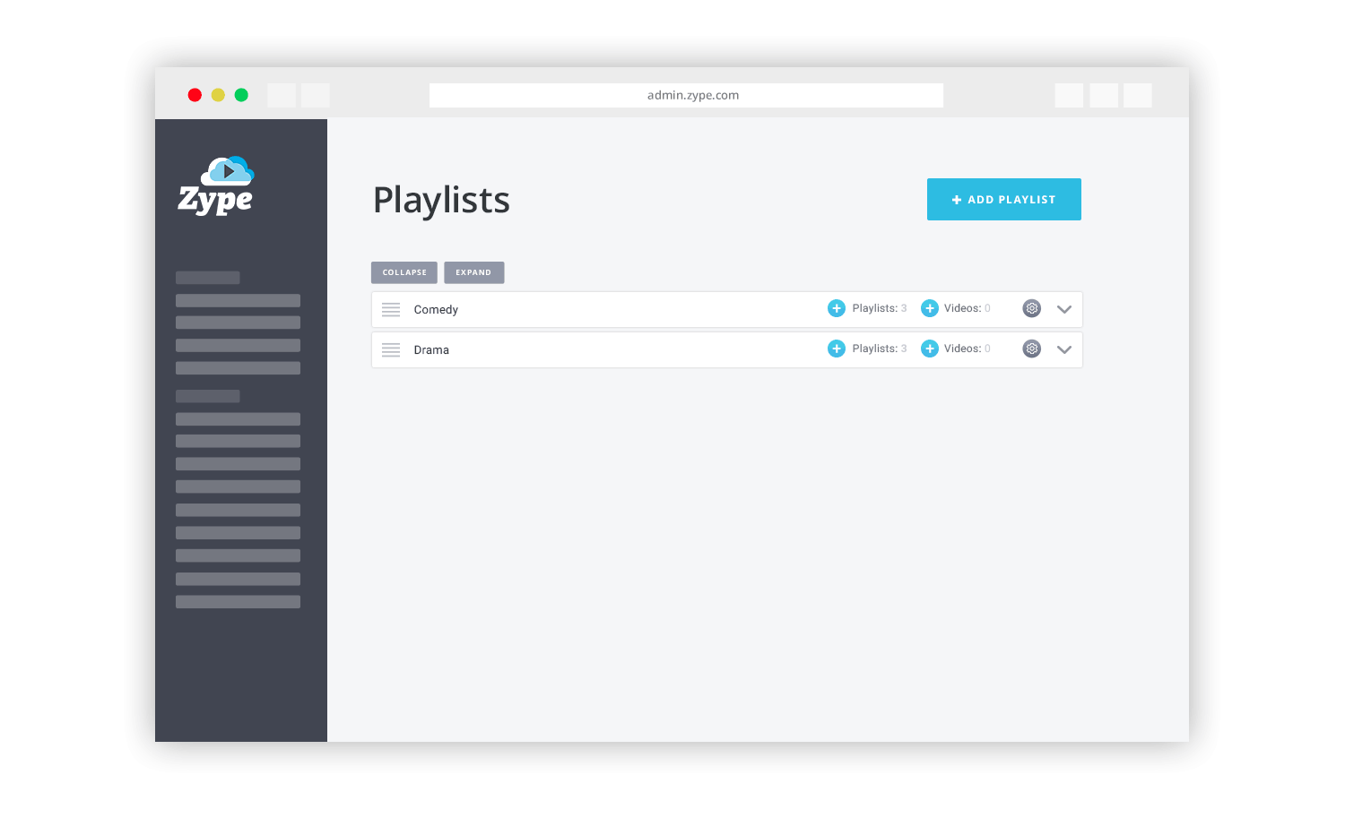
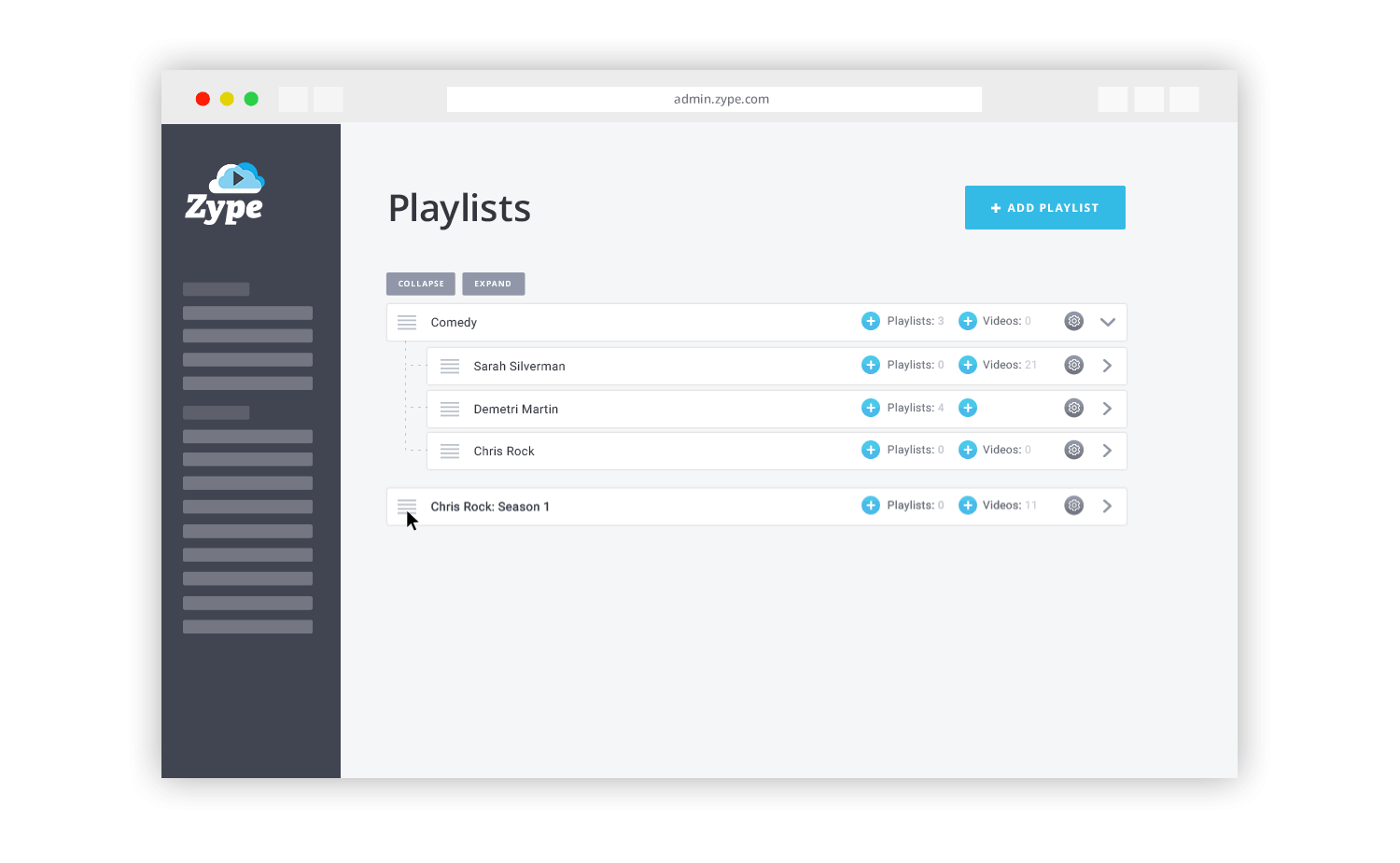
Working closely with the Customer Success team we learned clients were getting frustrated with the lack of flexibility in organizing their videos. Zype customers had no way of creating content hierarchy and had to resort to standalone folders, or playlists. (For example, a “Drama” playlist with no way to nest the “The Handmaid’s Tale” playlist and “Game of Thrones” playlist underneath)
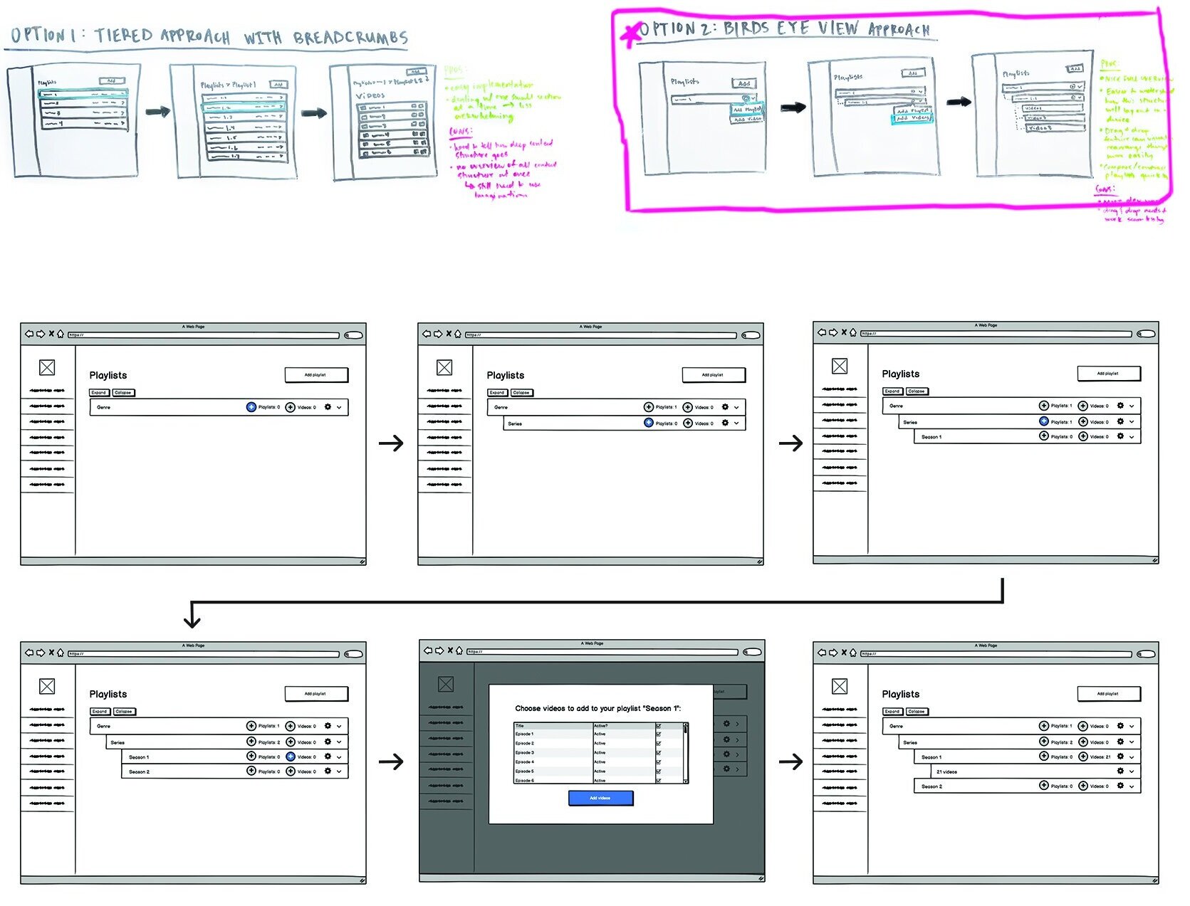
To answer this need, we knew we needed to choose the best visual representation for this hierarchy (a common one being the Genre > Series > Season > Episodes structure) so that clients could understand how their content would be displayed on all devices. With a competitive and comparative audit, rough sketches and quick internal feedback, we landed on a bird’s eye view approach to help our users understand their content structure at a glance.
We tested with clients and negotiated with leads...
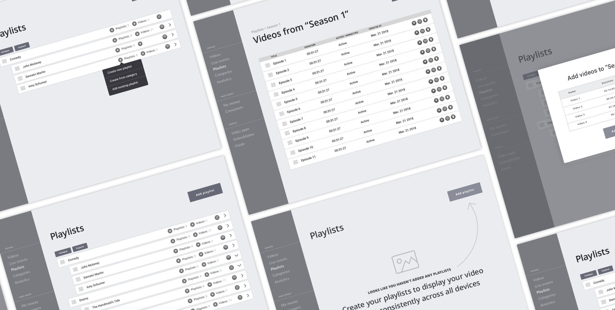
I tested our initial prototype with 4 customers. The main takeaway was that customers felt overwhelmed by the amount of new functionality. With this, we decided to bump a few features that didn’t seem to compromise adoption. Testing this with our customers also allowed me to effectively push to remove a few features leadership wanted to include in the product launch. For example, 4/4 customers said they would happily take advantage of this product without the feature to duplicate playlists
After tweaking the prototype based on these user interviews. we were ready to develop our MVP which would primarily focus on getting the drag and drop functionality to work seamlessly so that users could quickly move their playlists around without frustration.
With some final UI touches, we launched and saw initial positive results…
We sprinkled on some UI, implemented a few first-time user callouts and launched a simple and intuitive product.
The first few weeks our Customer Success team received calls about the drag and drop functionality acting finicky. Working through the smoothness of this with developers, we got it to a good place and then started to see a huge drop in calls concerning this feature.
Although, at the time, we didn’t have a great way to track call-ins to Customer Success concerning this feature, the Customer Success team said there were very few call-ins around it in the following months. A few of our trusted customers said they were very pleased with this new feature.