Ticketing and communication tool
A tool for our customers to understand the status of their tickets and easily communicate on them.
-
Context
Knotel offers flexible leases and office services around the globe. One of these services is taking care of customer requests and issues for their office space.
-
Problem
Only 8% of our customers gave Knotel’s ticketing and issue resolution experience an NPS of 9 or 10. Customers were getting confused on the status of issues and if anyone was working on them.
-
Business goal
Generally, to increase customer satisfaction which we hypothesized would lead to more renewals.
-
Product goals
Increase the percentage to 20% of customers giving the ticketing experience an NPS of 9 or 10 within 3 months.
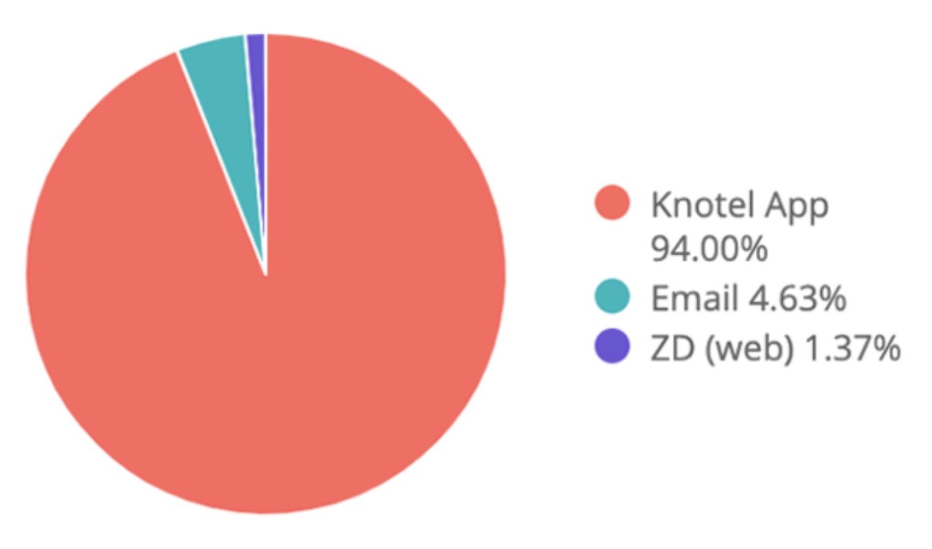
Increase customers submitting tickets in app vs by email from 92% to 95% in one quarter; we strongly believed streamlining all ticketing communication through one channel would help decrease customer confusion.
We interviewed customers and uncovered pain points…
We interviewed office managers from a variety of Knotel spaces and started to see a few trends emerge.
Two of the trends we consistently heard:
Confusion around progress in getting issues fixed
“The last ticket I submitted was just a couple of hours ago, because we ran out of paper towels in the bathroom. But this is the second or third time I’ve submitted the same ticket because I don’t know what’s happening and we need paper towels.” - Knotel Customer
Confusion around who a customer’s point of contact was at any given time
“We learned on a Monday that we would have a new SOM by Wednesday - and the issues that we had already submitted tickets for had to be re-explained.” - Knotel Customer
We brainstormed around MVP and future-forward ideas…
Alongside the researcher, we took a variety of sketches addressing our main problem to a handful of Knotel Office Managers. We wanted to do a little double-dipping, so we not only pulled feedback on features we were considering for MVP, but also features in our future-forward bucket.
Themes we tested (with reference wires below):
(MVP) Viewing and interacting with tickets: understanding the minimal amount of features and information to add enough value
(MVP) Homepage refresh: understanding what information, especially around ticketing, was valuable on their homepage
(Future-forward) Updating the submit-a-ticket flow: understanding if a fun, more interactive step-by-step submission process would be more engaging to submit tickets
(Future-forward) Misc. ideas: assessing value in potential features and prioritizing them
We pulled out takeaways around each theme and honed in on a prototype…
Some insights and design additions:
Ticket overview:
It’s helpful to see the title of the person taking the ticket to better understand where their issue is in the process
We found how we internally tag an issue’s status doesn’t translate externally. For example, we use “On hold” for a Knotel employee to understand they’re waiting on a customer’s response; from a customer point of view, “Needs reply” gives them a better understanding the ticket’s in their court.
2. Ticket interaction:
We decided to go for a chat interface over an email interface since we found office managers preferred a feeling of immediacy and quickness in responding to Knotel employees.
A few Customer Managers were slightly hesitant with this approach, worried that a customer may expect an immediate response from them. We decided to move forward but stay close in monitoring this feedback.
3. Homepage options:
The current homepage didn’t reflect what most customers came to the app for: submitting a ticket. We kept it simple and prioritized the known use cases at the top of the page: ticketing and booking.
Data points around “Open tickets” and “Pending your review” were valuable to Office Managers. Understanding the number of open tickets was a good metric to report on and understanding which of those were sitting in his/her court reminded them to take action.
We launched…
Positive anecdotal feedback made us feel we were on the right track. However, ideally we would have sent another NPS survey 3 months after this feature came out to more accurately measure success.
Anecdotal feedback from Knotel customers:
“I love this! I like that it’s more of a chat, saves me from going back-and-forth through my emails.”
“When are you releasing this? I can’t wait.”
Quantitative metrics to help inform our goals:
After 3 months we saw an increase from 92% to 94% in customers submitting tickets solely though the app; we felt good in this trend to centralize all issue communication.
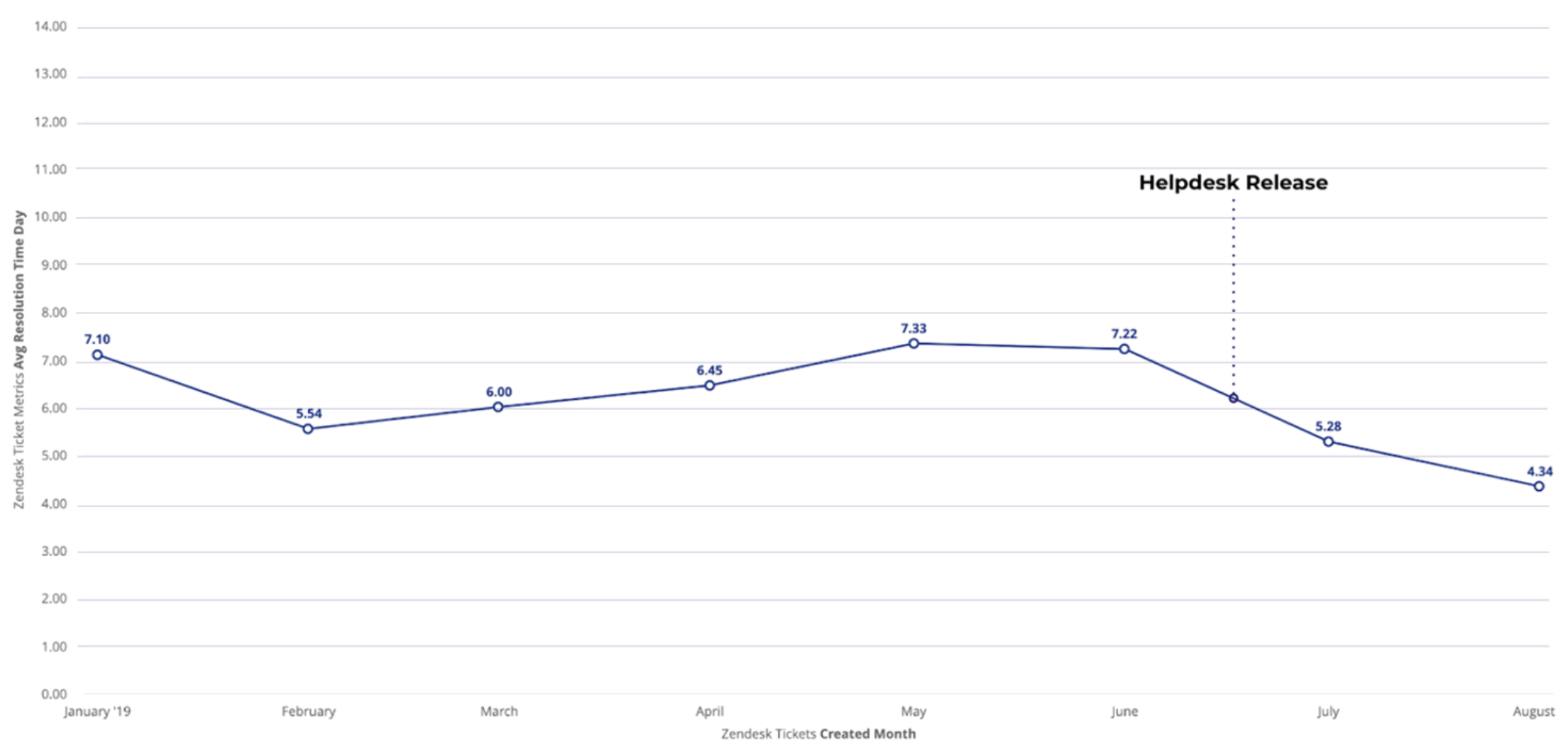
Although we didn’t originally set out to achieve a decrease in time to resolution of tickets, we wanted to monitor any potential correlation here. We noticed a drop in average days to solve issues after the ticketing service was launched.
I’m very proud of my small team for executing on this project in a short timeline. Upon reflection, I wish I had pushed us to track other interesting data points on first launch (data point like: average number of visits to check ticket status or average number of back and forth exchanges for ticket resolution). From here, we could better understand if any other variables positively or negatively affect customer satisfaction.


